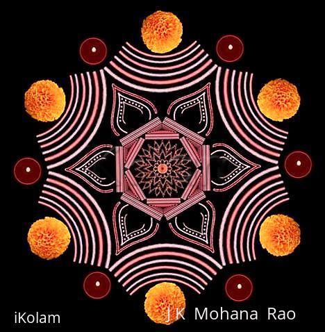
hexagonal paDikOlam - 2
About hexagonal paDikOlam - 2 : PRINT
This is another paDikOlam in the hexagonal shape.
Regards! - mOhana


Comments
radpri
Sat, 2009-08-22 03:40
Permalink
very nice & cute design jkmji...
Purni
Sat, 2009-08-22 19:27
Permalink
Great Work, JKMji..... The Red and White imply Vibhoodhi & Kumkum to me.... It sure is a wonderful piece of work...
lakshmiraghu
Sun, 2009-08-23 20:54
Permalink
mOhanaji it looks very nice and different...
judelined
Mon, 2009-08-24 01:35
Permalink
Neatly done JKM - but I personally feel that the marigold is very distracting....
jkmrao
Tue, 2009-08-25 17:24
Permalink
Thanks everybody! You're not alone, some others also felt that the floweres must not find a place there
Regards! - mOhana
judelined
Wed, 2009-08-26 22:46
Permalink
I said this because this particular flower looks bright and bold which makes the padikolam looks milder, whereas it should have been the other way round I thought...
ruby25rose
Fri, 2009-10-09 04:19
Permalink
dear sir,
ur kolam looks too good, and can u help me to draw the kolam in photoshop or Ms paint , word,
with little bit of procedure.
i will be great thank ful to u,
i have lot of kolam to draw in book but i want to upload everything in ikolam can u please tell me
if u can mail me the procedure it will me very useful
My email ID ruby25rose@yahoo.com
Regards,
mahalakshmi
malar anand
Sat, 2009-10-10 01:24
Permalink
very nice & different one sir.