Margazhi dew drops Kolam contest - 2008-2009
About Margazhi dew drops Kolam contest - 2008-2009 : PRINT
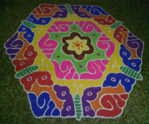
Its a dotted kolam.Sandhu pulli 17-9..It is drawn by connecting through the dots(Sandhu Pulli) and i spend two hours for this kollam.
Materials Used:Rice Powder,Color Powders,Sand


Comments
brintha
Sat, 2009-01-17 20:08
Permalink
very neat work
beautiful also
jayamohan
Sun, 2009-01-18 19:37
Permalink
Very good design. Neatly done.
You could have brought the brown color to the centre which will make it more attractive!
rajamma_2
Sun, 2009-01-18 20:04
Permalink
nice design and neat work. color choice could have been better
indirasundhar
Sun, 2009-01-18 21:37
Permalink
nice design ,neat beautiful
judelined
Mon, 2009-01-19 00:42
Permalink
cool work
Rradharavi
Mon, 2009-01-19 01:29
Permalink
good one
s.srividya
Mon, 2009-01-19 02:11
Permalink
superb
lakshmiraghu
Mon, 2009-01-19 04:49
Permalink
excelent design and neat work
jkmrao
Mon, 2009-01-19 12:01
Permalink
Very nicely executed. But symmetry was destroyed
by the colours. Otherwise, really nice. Best
of luck and regards! - mOhana
jayashri1958
Mon, 2009-01-19 21:18
Permalink
Good Kolam but it could have been looked better if u had given the colors in an better way
G.Padmavathi
Mon, 2009-01-19 23:07
Permalink
Nice design, neat and beautiful work
sundarmaya
Mon, 2009-01-19 23:25
Permalink
very good symmetry and uniformity u have but the colour choice is not good. always make the centre bright and dark with lighter colours on the outside which will give a 3D effect to any kolam
krithikaa21
Wed, 2009-01-21 21:15
Permalink
Beautiful and nice kolam kavitha. I can c ur hard work in your kolam. All the Best for u.
Kavitha Natarajan
Thu, 2009-02-05 04:42
Permalink
it is veyr nice i like very much.
devikak
Fri, 2009-04-10 02:25
Permalink
very beautiful work. Keep it up.
devikak
Fri, 2009-04-10 02:53
Permalink
Dear Lata,
What happened to the old kolams. Will it be available in future.