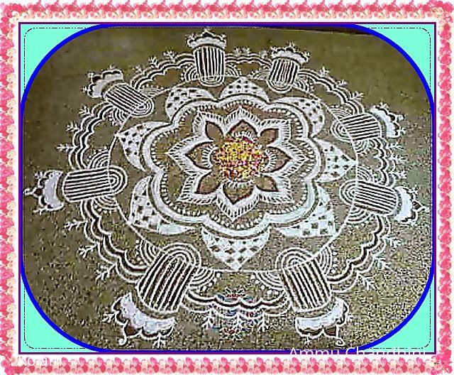
ONAM AL-(PONA)-POO KOLAM
About ONAM AL-(PONA)-POO KOLAM : PRINT
Hai to all...I wanted to try a pookolam for Onam...but due to demand of flowers today...I did this fusion of ALPONA+POO kolam....with d available flowers...it took me 2 hrs to finish this design...ur views pl....


Comments
Vinci
Sun, 2010-08-22 20:42
Permalink
Thanks for sharing, uploading a Superfast kolam and thanks to Lata..
Lovely design Rani Maam.. The centre and the checks in the border looks nice.. Kaavi only for Special Ocassion other than Tuesday and Friday!!! I feel the cylinders are little distracting, not merging with the centre design, Just my opinion.. And the picture resolution doesn't allow to enjoy.
ammuchandhini
Sun, 2010-08-22 21:35
Permalink
thanks vinci...every word what u said about d pic was perfect vinci....it took almost half-an hour on my editing table ...imagine...to resize, to brighten d image, to sharpen it ...as i did this in my drawing hall...d upper part which was close to d window appeared dark and i couldn't do anything to brighten that portion only ...so d pic resolution was this way...actually i wanted to do this again in d outdoors...but due to heavy rain here yesterday....i couldn't do it....
Lata
Sun, 2010-08-22 21:59
Permalink
Beautiful design you've chosen to make, Rani. Nice fusion of alpana and onam.
But, what was the need of brightening and sharpening? A little bit of darkness here and there is sometimes unavoidable and understandable. Isn't it?


What ever happened to giving us a taste of your art just plain and as it is, Rani? I am starting to miss it
I went back to the following image to get a taste of your old style (simple, pure and unadulterated)
http://www.ikolam.com/node/14194
ammuchandhini
Sun, 2010-08-22 22:06
Permalink
o.k latha...if u feel it that way...i am so happy...as i have not still ventured into pc kolams i just wanted to try some frames and borders ...thats all...o.k...in my future kolams i shall keep ur words in mind....thanks a lot for sharing ur opinion....
Lata
Sun, 2010-08-22 22:16
Permalink
My thinking is that you should venture into all types of kolams Rani, PC, floor, using all mediums. Go ahead and play with all sorts of borders/effects and what not. But, do treat us to your old style "pure" kolams too.
Lata
Sun, 2010-08-22 22:26
Permalink
Could you please upload the original image? I am eagerly looking forward to see this design in its original form (without any photo effects). Take your time. Give me the brownish aval that you have in your hands, the same aval that you only get in villages nowadays.
(aval=beaten rice, also known as poha)
ammuchandhini
Sun, 2010-08-22 23:02
Permalink
O.KKKKKKay latha....I was just thinking a little before to do d same design at my original place(outside) and share with u people....nice that u too have asked the same....sure I shall upload u d original pic in d cafe section ...oh so d dotted masaic looks like aval to u dear....courior seyyava....he he.....
P.Veni
Sun, 2010-08-22 23:15
Permalink
Iam the only friend saw the original kolam.It was also a nice one.
ammuchandhini
Mon, 2010-08-23 00:10
Permalink
thanks veni and pl do come today evening to help me in redoing this on d floor...okvaaaa?
Padma Prakash
Mon, 2010-08-23 01:22
Permalink
Nice RAni. But something is missing compared to your usual visual treats which were outstanding. OK we wait for the other version.
brindhanagesh
Mon, 2010-08-23 03:18
Permalink
Beautifully made alpona+poo kolam, Rani. You could have left it as it is with out sharpening and brightening it. this is very similar to Lakshmi Jayaraman's Alpona design except one or two differences. You have done full justice to the original.
brindhanagesh
Mon, 2010-08-23 03:21
Permalink
http://www.ikolam.com/node/13491
ammuchandhini
Mon, 2010-08-23 04:07
Permalink
thank u padma, and brinda....oh...brinda..u r so correct...its d same design...even i have commented on it.....howcome i forgot it....thanks anyway....just see my plain version on d floor and tell me ur views...
rajamma_2
Mon, 2010-08-23 06:13
Permalink
Rani. when you try a different style these small mistakes happen. But it is nice to take a challenging job and achieve it also. Play attention in editing the photo.
rajamma
ammuchandhini
Mon, 2010-08-23 06:37
Permalink
thanks a lot rajamma mam for ur views....i shall do so what u have suggested....
dibbutn
Mon, 2010-08-23 07:06
Permalink
Rani maam Happy Onam to you... this kolam looks lovely and yes looking forward to the original form of this kolam
ammuchandhini
Mon, 2010-08-23 19:13
Permalink
thank u push and jaaanu...
judelined
Wed, 2010-08-25 22:40
Permalink
Pretty experiment Rani - has come out quite good. I suggest you first draw the basic design with chalk on the floor to get the symmetry correct as you can make corrections while drawing with chalk and then top it up with the final medium, this way you will get it more perfect - but you definitely need a pat on your back for giving us something new from you
ammuchandhini
Thu, 2010-08-26 00:20
Permalink
thank u judy...but it was not clear on my mosaic floor when I drew with a chalk....thats why Idirectly drew with kolam maavu.....If it had been a cement floor then u may be right....