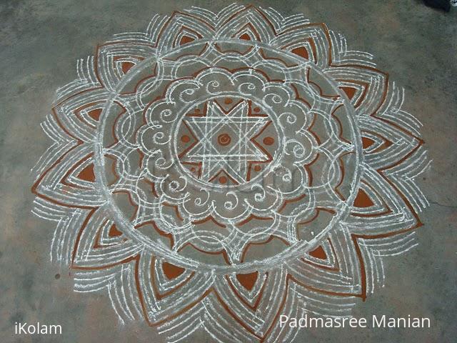
Varalakshmi vratham kolam
About Varalakshmi vratham kolam : PRINT
Here is my varalakshmi vratham kolam. This is made of riceflour with little kolapodi. Ur suggestions pls..


Here is my varalakshmi vratham kolam. This is made of riceflour with little kolapodi. Ur suggestions pls..


Comments
ammuchandhini
Sun, 2010-08-22 00:35
Permalink
appappa padma...ur double strokes and freehand design and d kavi...r all too good...awesome....
chandy
Sun, 2010-08-22 01:44
Permalink
No suggestions. Excellent and bright
Vinci
Sun, 2010-08-22 02:12
Permalink
Elegant with double strokes and kaavi.. Well done... The outer border looks cute, counting missed...
dibbutn
Sun, 2010-08-22 06:14
Permalink
Wow Padma maam what an amazing double stroke kolam and the kaavi adds to the beauty... this kolam reminds me of the ajji's kolam during the ikolam meet at Bengaluru
Sumaginger
Sun, 2010-08-22 08:10
Permalink
WWWWWWow ! so beautiful. Thanks for sharing. Feel like seeing again and again. God bless you.
Vasi
Sun, 2010-08-22 09:46
Permalink
Very nice & neat.
Vasantha
subashini
Sun, 2010-08-22 10:28
Permalink
very very nice and attractive.double stroke super padma.
Lata
Sun, 2010-08-22 22:02
Permalink
Looks lovely! Well done.
Padma Prakash
Mon, 2010-08-23 01:27
Permalink
Lovely kolam Rajusree. Though the kolam looks simple, the way you have presented using double strokes and kavi at right places has enhanced the beauty of it.
brindhanagesh
Mon, 2010-08-23 03:29
Permalink
pretty double ezhai kolam with kaavi to give a nice contrast, Padma. the outer border is very pretty.
rajamma_2
Mon, 2010-08-23 06:26
Permalink
Doble stokes, thin ezhai, neat drawing, apt kaavi at correct places are the plus points of this lovely kolam.(, only drawback is the outer petals are 13 in numbers)
rajamma
Dawn
Tue, 2010-08-24 00:04
Permalink
How you manage the even distance between lines foxes me!
Rajamma ma'am, what sharp vision to have spotted the 'odd' ( pun intended!) number of petals. It is such experience and knowledge from people like you that will help others to perfect their work. Thank you.
shobhapad
Tue, 2010-08-24 03:54
Permalink
Very attractive double strokes kolam with kavi border looks vert attractive and elegant.
Rajusree
Tue, 2010-08-24 18:40
Permalink
Thanks one n all for the encouraging comments.
judelined
Wed, 2010-08-25 22:49
Permalink
This open ended kolam is so tempting as you keep wanting to extend and extend till your back hurts (right na??). Just found how I missed this kolam (did not see so many kolams during the weekend so I just commented on all of them), sorry about that dear. This is truly a lovely kolam. Quite densly packed. Your double strokes makes the outside lotus look lovely. But as Rajam pointed out the only flaw is the number symmetry. The centre has eight so I think you should have followed it with 16 instead of 14 and 13 for the outside. Never mind, who cares, as long as it looks pretty which this sure is