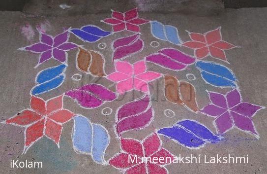
Star kolam
About Star kolam : PRINT
This is interlaced dot kolam .The dot count for this kolam is 15-8.Do all like this kolam all are enjoy to see my kolams..................

This is interlaced dot kolam .The dot count for this kolam is 15-8.Do all like this kolam all are enjoy to see my kolams..................

Comments
alameluranganath
Tue, 2010-07-13 02:12
Permalink
very nice
rajamma_2
Tue, 2010-07-13 02:28
Permalink
Meena., nice old design . very neat and beautiful. In the inner circle color symmetry is missing.l
rajamma
vasanthidlr
Tue, 2010-07-13 09:54
Permalink
hi ur kolam is good. one small suggestion while colouring a kolam first u choose one design in that kolam and choose a particular and apply to it .and for the next type ofdesign u select another any suitable colourand apply to it .u try likr this and find the difference between the two presentation.never use multi colour for a similar pattern in a kolam. in this kolam for outer star instead of three colours if u use a single colour it willgive rich look .like that in each row.in the middle row instead of that 2 brown colour if u use the ame majentha it willlook nice.this is my humble suggestion .dont mistake me mam.
ammuchandhini
Tue, 2010-07-13 18:53
Permalink
hai meena...lovely kolam...vasanthi mam thanks for d tips on colouring....
sudhabalakrishnan
Tue, 2010-07-13 21:09
Permalink
meena, very neatly drawn strokes and looks very beautiful
lakshmiraghu
Tue, 2010-07-13 22:31
Permalink
neat and sweet rangoli
dibbutn
Tue, 2010-07-13 22:57
Permalink
Meena maam nice kolam
brindhanagesh
Wed, 2010-07-14 02:56
Permalink
Neatly drawn kolam. Take more care while choosing the colours.
shobhapad
Wed, 2010-07-14 14:18
Permalink
Neatly drawn but you forgot to colour the inner circle.It will give rich look if you filled with dark green .
jkmrao
Fri, 2010-07-16 09:25
Permalink
Good work and nicely coloured. To an extent, I agree wtih vasantIjI's comments wrt colouring.
Regards! - mOhana
judelined
Fri, 2010-07-23 02:26
Permalink
Vasanthi, no need to feel bad you have given a valuable suggestion and I am sure Meena will try it next time.. Overall neat kolam and well presented...
umaraja
Mon, 2010-07-26 01:57
Permalink
meena pls use vasanthis tips and of course do avoid pale colors, but anyhw its a gud try