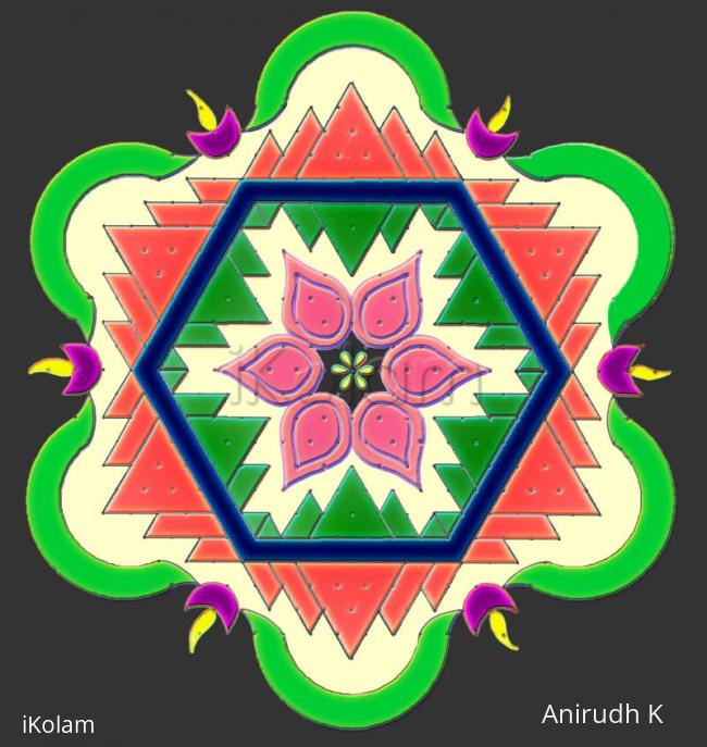
Copycat - Hexagonal Padi Hase
About Copycat - Hexagonal Padi Hase : PRINT
Here is the copy of mOhanaji's Hexagonal Padi rangoli. I have used dots to get somewhat close to it. Drawn on paper and colored using photoshop.
Dot count: 23 X 12
orignal masterpiece: http://www.ikolam.com/node/11700


Comments
ammuchandhini
Tue, 2010-05-18 21:31
Permalink
this has come out pretty well anirudh...thanks for d idea for drawing on paper and colouring it in photoshop...
Sumathi.v
Tue, 2010-05-18 22:16
Permalink
Subtle color combination Anirudh GOOODDD
rajamma_2
Tue, 2010-05-18 22:38
Permalink
that is Masterpiece and this is Sishya- piece.light coloring is soothing to the eyes. Can u explain how to color paper drawing in potoshop?( U know we r LKG in potoshop)
rajamma
alameluranganath
Wed, 2010-05-19 00:07
Permalink
very nice and gt8 color combination
brindhanagesh
Wed, 2010-05-19 02:59
Permalink
Nice try and you have succeeded in that, Anirudh ! My only suggestion is, you could have used the same green outside also.
Rajusree
Wed, 2010-05-19 06:39
Permalink
Excellent job Anirudh. The colors looks very pleasing.
dibbutn
Thu, 2010-05-20 00:12
Permalink
Anirudhji wow this is an excellent outcome of an already wonderful design yet looks different from the original.. the overall product is very very pretty... just one thing i felt was the dots left unattended you could have done something about that, just an opinion, yet this looks fabulous
anirudh
Thu, 2010-05-20 01:51
Permalink
thanks to all.
rajammaji, missed to add scanned.... most often i draw on paper then scan and color the pic in photoshop. only thing we need to ensure is the lines drawn should be little dark and no gaps in between becos filling colors becomes time consuming as color fills in other areas through the gaps. then we will need to use select tool to select the area and then fill....hmm may be demo next time
Sure Brindhaji, will make the change and see.
Pushpaji, i missed to make traingles in the outer ones ...inner ones normally i used to earse them, but left them as it is for the counts.
sudhabalakrishnan
Thu, 2010-05-20 03:37
Permalink
Supperb and Awesome inspirational kolam. I think JKM sir will be very happy to see his work done by you. No words to explain. well done.
jkmrao
Thu, 2010-05-20 04:03
Permalink
As I mentioned earlier, I am way behind in i-kOlam and I missed this. What caught my attention was SrI aniruddhA's comments about dark lines and filling colours. Then only I went to the original and got the surprise. I am really very much humbled. I just make these to amuse myself and in the process trying to make others enjoy. Yes, this is a good re-creation and in its own way another original and so I congratulate SrI aniruddha. It also proves my theory, that any rangOli can be "dotted" Occasionally, I amuse myself by placing a rangOli on rectangular or hexagonal grid and adjusting the magnification of one or the other so that the dots fall in place. Yes, the lines must be thick and continuous and there must not be any gaps and then only it is easy to fill colours. When I arrange my patterns, sometime it is very difficult to avoid gaps as the "Ctl" button can only go so far and no further! Sometime I overcome this by using "edge detection" to thicken the lines or use the "blur" command to close the gaps. Again, thanks aniruddhajI.
Regards! - mOhana
anirudh
Fri, 2010-05-21 01:29
Permalink
thanks mOhanaji, i was waiting for your comments, please call me just aniruddha, thank you sooo much.
thank you Sudha.
indira sundar
Mon, 2010-05-24 12:42
Permalink
Anirudhji....very good job ...i like center design...-Indira
judelined
Tue, 2010-06-01 04:01
Permalink
Hey Anirudh this is really wonderful - I love the texture very much. Semma creation - great work
anirudh
Thu, 2010-06-03 23:14
Permalink
thanks Judy, Indiraji.