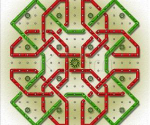
simple rangoli
About simple rangoli : PRINT
Instead of straight dots 3-1, I used `+' symbol and double stroke for this simple kolam. I think this is oldest way to put rangoli using double stroke, four strokes. There are many rangolis of these style, can help me to get all those.


Comments
kalaishanmugham
Thu, 2010-04-22 21:11
Permalink
shadowing மற்றும் கலர் combination ரொம்ப அருமையா இருக்குங்க. சிம்ப்ளி சூப்பர்.
mvrajitha
Thu, 2010-04-22 21:44
Permalink
Please translate in kannada, since I don't know to read tamil
Lata
Thu, 2010-04-22 22:19
Permalink
She says "The shadowing and the color combination is very nice. Simply super". And, I agree with her.
The image could have been a bit smaller.
mvrajitha
Thu, 2010-04-22 22:34
Permalink
Thanks kalaiji and lataji, I will take care of the size of the picture in future.
lakshmiraghu
Thu, 2010-04-22 22:45
Permalink
looks beaautiful and nice shading...
rajamma_2
Thu, 2010-04-22 23:56
Permalink
the shading effect is very nice. we will give such + kolams for u . wait.
rajamma
ammuchandhini
Fri, 2010-04-23 02:53
Permalink
hai rajitha... lovely photoshop kolam...d cols are very attractive....d shadow created is also awesome...
Rajusree
Fri, 2010-04-23 07:16
Permalink
Very nice photoshop kolam. The colors r really attractive. THe shadows r very creative.
anirudh
Fri, 2010-04-23 07:42
Permalink
this looks cool with nice shading, today morning one of my neighbour had a similar design with 11 + signs and joined but without shaing effect ...thanks for sharing.
Vinci
Fri, 2010-04-23 11:00
Permalink
Nice work..
Padma Prakash
Fri, 2010-04-23 22:54
Permalink
Vice nice double stroke and shading.But the double stroke is not complete in joing the + symbols and ends with single stroke. Thank you rajitha.
alameluranganath
Sat, 2010-04-24 01:18
Permalink
looks nice and gud one
judelined
Sat, 2010-04-24 01:27
Permalink
Rajitha this is really lovely. Would have been excellent if it fit in the screen as a smaller image. Effects are superb and so is the colour combination
gvidhya
Sat, 2010-04-24 08:18
Permalink
color comb is lovely rajitha
indira sundar
Sun, 2010-04-25 00:51
Permalink
Very beautiful kolam with nice color combibnation Rajithaji...-Indira
sreegiri
Sun, 2010-04-25 10:31
Permalink
Beautiful kolam design.
jkmrao
Mon, 2010-04-26 05:26
Permalink
Good work. I would have liked it plain without shadows etc. Another thing I would have joined the blue line to the centre of the plus sign, not as done.
Regards! - mOhana