Margazhi Dew Drops Rangoli Contest - 2010
About Margazhi Dew Drops Rangoli Contest - 2010 : PRINT
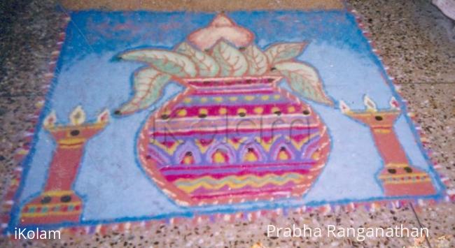
This is free hand drawing representing a mat with picture of kalasm and lamp. Since we keep kalasam and light lamp for any auspicious function this rangoli is a good start to welcome marghazi. Various shades of Rangoli powder is used for this.
Rangoli is for one who is passionate about what they are doing.Only the Creator knows the joy of creation.


Comments
lakshmiraghu
Wed, 2010-01-27 05:47
Permalink
nice kalash!!leaves looks nice.Wish you all the best!
Vinci
Wed, 2010-01-27 23:34
Permalink
Decorated kalasam looks grand. Extra dots on vilakku looks detached from the kolam.
All the best.
jkmrao
Thu, 2010-01-28 09:21
Permalink
First look - attractive,
Creativity - traditional,
Details - The leaves could have been coloured green, the lamps are disproportionate, pot colours are good.
Symmetry - good,
Overall - good.
Regards! - mOhana
prabharangan
Fri, 2010-01-29 19:39
Permalink
Thank you for the valuable suggestion.
Regards
Prabha
sudhabalakrishnan
Thu, 2010-01-28 23:41
Permalink
very nice kalasham, wish you all the best
dibbutn
Fri, 2010-01-29 05:31
Permalink
Prabha ma'am you are absolutely right only the creator knows the joy of creation... beautifully done kalasam
prabharangan
Fri, 2010-01-29 19:44
Permalink
Thank you all, for your true suggestions. This motivates me to do lot more.
Regards
Prabha
Lata
Fri, 2010-01-29 20:35
Permalink
Your Kalash-rangoli is beautiful! Your effort on the shades of green and tan add the necessary depth to it to make it look so realistic. We don't have that many rangolis with the Kalash as the main design, and so this is extra special! Thank you for participating and good luck.
judelined
Fri, 2010-01-29 23:01
Permalink
Nicely presented rangoli - the blue is really very pretty (makes the rangoli stand apart from the flooring) and the kalasam is nicely decorated - the only thing I find out of proportion is the size of the coconut, which should have been bigger than the size of the leaves - all the best