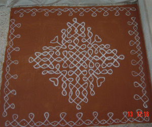
Margazhi dew drops Kolam contest - 2008-2009
About Margazhi dew drops Kolam contest - 2008-2009 : PRINT
It is dotted kolam.it has made with rice powder,sand and colour powders.
It is a sandhu pulli.17 Pulli to 9 sandhu pulli.I am sending this for contest


Comments
svnarasimhan
Sat, 2009-01-17 19:25
Permalink
rajamma_2
Sat, 2009-01-17 23:14
Permalink
neat and nice
srinivasan1
Sun, 2009-01-18 00:39
Permalink
very nice
ushakalimuthu
Sun, 2009-01-18 05:17
Permalink
neat color combination
viji_j86
Sun, 2009-01-18 06:05
Permalink
very nice
viji
sailaja.s
Sun, 2009-01-18 06:06
Permalink
such neat work ,but somehow blue dominates.maroon would have been excellent
jayamohan
Sun, 2009-01-18 06:56
Permalink
Strokes are neat and design is different.
Symmetry and contrast in colour will make it more beautiful.
sowmyarajesh
Sun, 2009-01-18 13:14
Permalink
Nice job
nhaniyur
Sun, 2009-01-18 21:04
Permalink
Beautiful and symmetrical - 4 stars
indirasundhar
Sun, 2009-01-18 21:15
Permalink
very good & neat
amruthaji
Mon, 2009-01-19 00:51
Permalink
can you give me the number of dots
maheswari.sanjay
Mon, 2009-01-19 01:10
Permalink
it is very nice. beautiful and neat work. good colour combination
lakshmiraghu
Mon, 2009-01-19 05:26
Permalink
good one, strokes are neat
jkmrao
Mon, 2009-01-19 13:54
Permalink
Quite nice, but the colours don't preserve the
symmetry. The strokes are good. There is a
mix of symmetries, is it intentional?
Best of luck and regards! - mohana
pearlhema
Tue, 2009-01-20 07:42
Permalink
The Kolam is very good.. This shows the work of a trained hands...
Good color combination...
Very nice and very neat!!
sharu 20
Sun, 2009-01-25 06:47
Permalink
good and neat
sgeethashankar
Mon, 2009-08-17 11:45
Permalink
Nice but colour combination may little be better.
vimala.1985
Sat, 2010-01-02 05:56
Permalink
very Nice.... I gonna try this for this pongal!!! Regards, Vimala
kaarumuri
Mon, 2010-01-11 00:44
Permalink
no words to describe but shall still use 'Awesome'. The idea of double border in white is something i never saw before. Very creative. Colors are very appealing to the eyes. But as some suggested, there is scope for a better color combination. Really Excellent work.