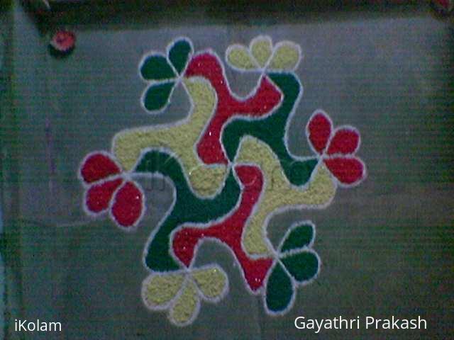
Diwali Rangoli - Contest - 2009
About Diwali Rangoli - Contest - 2009 : PRINT
I am attaching the kolam for the Diwali Rangoli contest.Here's wishing all the participants All The Best!!


I am attaching the kolam for the Diwali Rangoli contest.Here's wishing all the participants All The Best!!


Comments
dibbutn
Tue, 2009-11-03 06:29
Permalink
Very neatly done kolam with nice color combination...
lakshmiraghu
Tue, 2009-11-03 07:00
Permalink
neat, sweet, & cute ..nice colours..all the best
jkmrao
Tue, 2009-11-03 09:39
Permalink
Good colouring and symmetry. Could have been a bit brighter.
If you enjoy in what you do, you are certainly a winner
If you excel in your efforts, you are certainly a winner
Good luck!
Regards! - mOhana
indira sundar
Tue, 2009-11-03 20:29
Permalink
Neat and cute..
All the best!
-Indira
manivasuki62
Tue, 2009-11-03 22:37
Permalink
Neat kolam with bright colours.
anirudh
Wed, 2009-11-04 00:13
Permalink
simple design, but beautifully colored...very nice...yes diyas would have made it brighter
brindhanagesh
Wed, 2009-11-04 02:20
Permalink
Simple design but nicely coloured.
rajamma_2
Wed, 2009-11-04 04:02
Permalink
Traditional old design.
Neatly executed with nice 3 colors.filling symmetry is maintained
rajamma
bharathibhaskar
Wed, 2009-11-04 05:24
Permalink
simple design, but beautifully coloured
Sujatha Srinivasan
Wed, 2009-11-04 05:36
Permalink
Beautiful and neat work, a darker shade of yellow would have made it striking ! All the best.
pavan kashyap
Thu, 2009-11-05 02:12
Permalink
bright and cute
kameswari
Thu, 2009-11-05 07:44
Permalink
Neat kolam
rajee sriram
Fri, 2009-11-06 04:23
Permalink
Have you mixed the colours with powdered salt?
Pragaya
Thu, 2009-11-12 21:27
Permalink
Rajee Madam, the colours were not mixed with powdered salt. In fact the colours already had 'chamki' in it and I guess the glitter that it produces, gave the powdered salt effect on the colours in the photo.
Lata
Sat, 2009-11-14 22:19
Permalink
Thank you so much for participating in the contest, and for providing us a visual treat with this beautifully drawn rangoli!
(I too had assumed that glitter was added later on, thanks for the clarification).
jayamohan
Fri, 2009-11-06 22:14
Permalink
This design is called 'parijatham'. Nicely done!
Pragaya
Thu, 2009-11-12 21:16
Permalink
I never knew that this design is called 'paarijatham'. Thank you very much for giving me this info.
Also I thank one and all for giving very valuable suggestions which will help me improve in future. Actually I was to put orange or dark blue instead of yellow. Unfortunately I did not have those colours and had no time to wait till it was bought. This rangoli was an accidental entry for the contest. Later on when I learnt that there was a contest in ikolam, the rangoli which was already put, was clicked on the mobile and loaded on to the site. There was no time to decide and put a fresh kolam for the contest.
Needless to say, I liked and enjoyed each and every part of the contest and all the entries were very good and lots to learn from them.
prathitha
Sun, 2009-11-08 06:04
Permalink
very beautifully done. i felt that the shade of yellow used couldve been a little brighter. good work
Nalini Venkatesh
Sun, 2009-11-08 21:04
Permalink
cute
Vinci
Mon, 2009-11-09 06:07
Permalink
Loved your work, except the yellow color which downs the charm.... Guess taken in mobile phone....
Pragaya
Thu, 2009-11-12 21:19
Permalink
You guessed it right. It was clicked on the mobile phone and later on loaded on to the site.
Thank you