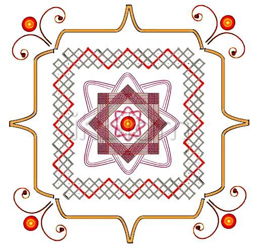
The red and gray lines look very nice in this design. The maroon colored squares at the center are also beautiful to look at.
Inner design is so beautiful mohanaji...
outer corner designs looks like the eyes of a lady with 'kumkum' and she is seeing the inner designs
-Indira
mOhanaji, nice innovative mixing. This Sona design , they put as border design in south India.If u go to any village u can see this .Only now I came to know its name.
Your new design is bringing out such imaginative vision from Indira also.The gopuram looks like the hands of the lady doing Pranaam to the kolam!!!
rajamma
Very Innovative Design, JKMji.... Your Sona Square is truly amazing..... the double brackets make a good frame to the Centre Design..... the tendrils & the diya give a delightful appearance to the Creation..... really superb, Sir..
Looks very traditional as well as innovative!
mOhanaji, perhaps, you might have heard that 3 stripes are not used to draw kolam, in general.
It is considered to be inauspicious.
I don't know whether it is followed everywhere or only in Tamilnadu.
A topic for discussion among members!
Very nice kolam mohanaji... I like the way you described it....
I enjoyed every bit of your description and the innovative padikolam,
I like the way the entire kolam is protected tenderly by those lovely brackets - neat presentation JKM :)
mOhanaji the centre portion looks very nice.beautiful kolam
very nice fusion rangoli mOhanaji... padi, chiku, naagabhanda, padma, tendrils, deepas...wow superb, each and every thing is good.


