paDi kOlam - 6
About paDi kOlam - 6 : PRINT
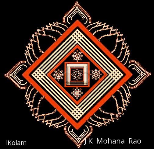
Most of the elements in this rangOli are from the toolkit! The only new ones are the flowers on all the four corners especially created for this and the central ashTadaLa padma. Regards! - mOhana


Comments
Lata
Tue, 2009-08-18 11:38
Permalink
The double stroked lotus outlines are looking very nice in this kolam. I also like how the orange dominates here (makes the outer squares pop out). I see a 3D effect in the 4 off-white lines.
lakshmiraghu
Tue, 2009-08-18 20:28
Permalink
mOhanaji beautiful kolam.orange gives rich look to this kolam
radpri
Tue, 2009-08-18 22:17
Permalink
beautiful work JKMji...
judelined
Tue, 2009-08-18 23:02
Permalink
Gosh! JKM this is really pretty...
rajamma_2
Wed, 2009-08-19 03:03
Permalink
mOhanaji, I am soooooo happy that you have also become a fan of padikolams. From your hand we can expect more and more new designs. This one is looking different with double line lotus and the orange color.
jayamohan
Wed, 2009-08-19 07:06
Permalink
Looks like a hand drawn padikkolam because of the natural looking ezhais!
Purni
Fri, 2009-08-21 02:14
Permalink
Amazing Work, JKMji....