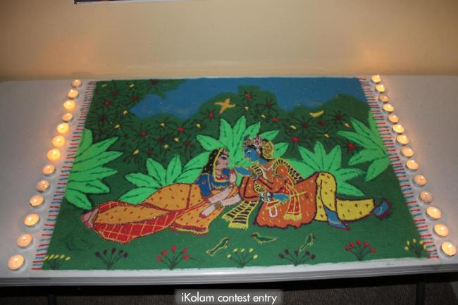
Radha-Krishna Diwali Rangoli
Submitted by Janakannan on Mon, 2011-10-31 16:21
My Gallery

This is the first time I am uploading a rangoli in this site. I am usually the visitor of this site admiring all the beautiful rangolis and the talents. Thought I will try something this time. I copied this design from a paint and used colored sand for the rangoli powder. Hope you all enjoy it. Any suggestions for improvement are welcome.


Comments
Suguna Murugesan
Thu, 2011-11-10 22:45
Permalink
wow looks like a painting! all the best!
ammuchandhini
Thu, 2011-11-10 22:57
Permalink
WOW...very neatly made rangoli...d cols r so natural and d lamps adding more beauty...all d best...:)
rajee sriram
Thu, 2011-11-10 23:00
Permalink
It looks like a painting. Very beautiful. ALL THE BEST.
dibbutn
Thu, 2011-11-10 23:02
Permalink
Wow it looks no less than a painting to me, excellent work, lovely choice of colors :O
umaraja
Thu, 2011-11-10 23:23
Permalink
wowwwwwww looks amazing,, i would feel more glad if u submit ur works regularly and participate in d commenting session,, this carpet looks awesome, waiting to see ur further submissions
all d best
vijaysowmya
Fri, 2011-11-11 00:08
Permalink
Looks like a painting work. So well done. all the best.
indu.rkc
Fri, 2011-11-11 00:29
Permalink
wonderful colouring!lamps add more beauty
julien
Fri, 2011-11-11 00:55
Permalink
Lovely presentation... of the radhai - krishna rangoli.... best of luck..
subashini
Fri, 2011-11-11 01:41
Permalink
excellent work.very beautiful rangoli.All the best.
Anisha Raghunath
Fri, 2011-11-11 01:54
Permalink
awesome rangoli looks beautiful....!!!!all the best....!!!!:)
Dr.Rekha Shetty
Fri, 2011-11-11 01:57
Permalink
Awesome dear .what a prettyradha-krishna dear.All the best
Chethan Srinivasan
Fri, 2011-11-11 03:34
Permalink
Excellent work.. No words to describe its beauty.. Nice usuage of colours and lovely presentation.
veena manigandan
Fri, 2011-11-11 04:56
Permalink
Beautiful work. Intricate and complex. The colouring is done so nicely.
jyotsnapathak
Fri, 2011-11-11 05:58
Permalink
looks like a painting, good work
indira sundar
Fri, 2011-11-11 08:58
Permalink
Excellent ...........All the best! :star:
ksankara
Fri, 2011-11-11 10:28
Permalink
Janakannan
Fri, 2011-11-11 14:58
Permalink
Thank you all for your encouragement!! Umaraja, yes I will participate more from now..
BalaChandrasekaran
Fri, 2011-11-11 21:50
Permalink
amazing jana.
lakshmiraghu
Sat, 2011-11-12 03:38
Permalink
looks like a painting, good work :star:
harinisudarsan
Sat, 2011-11-12 05:26
Permalink
Excellent work! Unbelievable!Great work...keep going.
chandy
Sat, 2011-11-12 05:47
Permalink
Very beautiful.
ananthiraju
Sun, 2011-11-13 02:55
Permalink
Wonderful rangoli.Looks like canvas painting.
smahalakshmi
Sun, 2011-11-13 03:04
Permalink
Fabulous presentation, Jana Kannan. Wonderful. Each and every aspect of your rangoli looks nice. Nice colour combo. We don't want you to simply admire the kolams submitted over here, but we also want you to interact with us on regular basis through commenting session and regularly upload your artistic works for us to enjoy.
ALL THE BEST. By participating in the contest, you are already a winner.
vlakshmi12
Sun, 2011-11-13 06:00
Permalink
Beautiful rangoli Jana It looks like a Rajasthani painting. The colour combination is fabulous and the diyas add to the beauty. After Sandeep sir's Peacock and Hen rangoli, this is another rangoli which has captivated me. All the best Jana.
Janakannan
Sun, 2011-11-13 07:58
Permalink
Thank you all so much!! SMahalakshmi, yes you are right. I love this site and this group and so you will see mee more interactive
Mohandoss Rekha
Sun, 2011-11-13 18:06
Permalink
Intricate design wonderfully made.. All the best
malar anand
Sun, 2011-11-13 23:07
Permalink
super
nithyaashok
Mon, 2011-11-14 01:27
Permalink
Lovely carpet, beautifully drawn and coloured
anirudh
Mon, 2011-11-14 09:38
Permalink
:star: superbly painted carpet....looks great all the best
deepali1502
Mon, 2011-11-14 10:09
Permalink
nice art.
Nalini Venkatesh
Tue, 2011-11-15 02:49
Permalink
wow...amazing, looks like a drawing
aditya
Tue, 2011-11-15 06:00
Permalink
Simply awesome!! Looks like a real rajasthani painting spread out!! thanks for this visual delight!!
Lata
Tue, 2011-11-15 16:12
Permalink
Beautiful! The main characters and the surrounding scenery looks awesome. The way you have presented the rangoli, as a mat with lighted diyas around the edges makes it more special.
Since you had asked for improvements, I would like to point out something that may be made differently next time. The bright leaves shown as a backdrop to the main characters tend to compete for attention (from Meera/Krishna). Maybe a duller shade of green could have worked better. I love Meera's gaze.
Thank you for participating in this contest.
Janakannan
Tue, 2011-11-15 16:58
Permalink
Thanks for you input Lata. You are right that green does look bright. Next time I will try lighter shade
alameluranganath
Wed, 2011-11-16 02:08
Permalink
wow really beautiful one and gud one.
alameluranganath
Wed, 2011-11-16 02:10
Permalink
simply superb one and gud one. :crown: