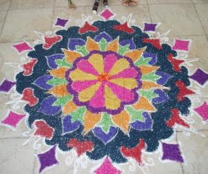
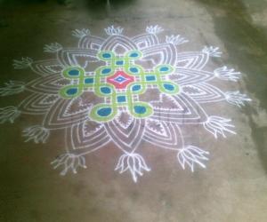
SuganthiMohan's quilled kolam...in colour kolapodi
About SuganthiMohan's quilled kolam...in colour kolapodi : PRINT
Just used the colour kola podi to copy the original. Though the quilling effect we could not get with the podi, I tried my best. It took nearly one and half hours to complete it. Suganthi inspired and Vidhya provoked usto do this.


Comments
ammuchandhini
Mon, 2010-06-28 19:40
Permalink
hai rajammaji....this has come out so lovely...i am wondering how u drew d thin lines with col podi....normally col kolam maavu is so silky na....thats why...
arunasivaji
Mon, 2010-06-28 21:46
Permalink
very attractive with bright colours maam. beautiful design.
judelined
Mon, 2010-06-28 21:49
Permalink
Wow, wow Rajam - this looks so beautiful. You have copied it so well. Every part has come out perfectly. The highlight is the zoomed in image of the kolam. I love the way the sunshine streaks are kissing this kolam. I think you forgot to finish the two flowers on the top right and left
suganthimohan
Mon, 2010-06-28 22:09
Permalink
I should also try with kolapodi, your's is beautiful rajamma.
gvidhya
Tue, 2010-06-29 00:21
Permalink
Rajamata jiiii romba romba rombbaaa prettyy... matching the original.. Ennachu one petal is missing in the top right corner outer lotus? paravalai adum oru new style ah than iruku
gvidhya
Tue, 2010-06-29 01:06
Permalink
I really need to say this.. Rajamata ji.. you are the one who is encouraging our team from the day 1.. In everyone's kolam am seeing your comments as first one.. your support is like an energetic drink for us.. Thanks a lott...
anirudh
Tue, 2010-06-29 01:26
Permalink
wow...pretty bright and colorful...rajammaji you have a nice tile frame too....
yes your words are encouraging to us to put some effort & try different variations and give due diligence to the art. ...thank you
nithyaashok
Tue, 2010-06-29 01:29
Permalink
Wow!, madam, your kolam is very bright and excellent, putting kolam directly in colour podi is nice
Not only the right top corner vidya, the left top corner's petal is missing, is it a design?
alameluranganath
Tue, 2010-06-29 02:08
Permalink
wow nice one rajamma mam
brindhanagesh
Tue, 2010-06-29 02:42
Permalink
This gives a different and nice look without the white kolapodi, Rajammaji! All the colours are bright but not irritating the eyes. (blue is so lovely). The twirls are perfect and shows the work of an expert:)
sudhabalakrishnan
Tue, 2010-06-29 04:49
Permalink
Rajamma maam, how r u? My PC was out of order so i was not able to log in to ikolam, really i have missed almost 15 to 20 days. About this kolam what to say ?????????/ For the design, for the colours, for the strokes, for the perfection i can give you 'O" grade - OUTSTANDING and a remarkable kolam it is really a feast for the eyes
dibbutn
Tue, 2010-06-29 07:24
Permalink
Wow Rajamma maam this is so so so lovely and pleasing colors used by you... we dont get to see kolams from u as often as we used to before... the white background highlights the colors even more in the sunlight... very beautiful maam
rajamma_2
Tue, 2010-06-29 09:21
Permalink
Thanks for all the appreciations. I thought more people will participate. Anyhow it was fun doing it jointly with out any exam fever. Each ones entry was unique in its own style. There is no comparison... I could feel the time and energy spent by everyone.I too joined only in the last minuite like Judy. The two flowers extension I could not put since the color powder mixed was over . By the time I mixed the new one the color became different, And the sun also peeped inside to see the kolam , so I hurried to take the photo. So missing parts are intentional only.
Pushpa, like Sudha I was on holiday in S'pore and enjoying with 3 kids, after return also busy with other committments hence the delay in posting new kolams. Adhaan kalaaykkaradhukku neengallaam irukkeengale!
rajamma
anirudh
Tue, 2010-06-29 12:01
Permalink
yes rajammaji, i wanted to be silent sneaker, but could not make it ....next time sure.
jayamohan
Tue, 2010-06-29 12:11
Permalink
Though this freehand design looks simple to look at, you realize how much time it consumes to draw on the floor/PC only after starting to copy it! Great efforts by all members! Rajam, I like your uniform lines and color choice!
Lata
Tue, 2010-06-29 12:41
Permalink
You're so right Jayaji!
 )
)
The kolam is very bright, and the strokes are so even. Your interest in participating is a great encouragement to one and all.
(Nice choice of words; "Vidhya provoked". That's exactly what she did
Rajusree
Tue, 2010-06-29 14:20
Permalink
Wow that's so lovely Rajamma maa'm. I thought i will also make it. But kids kids.... However urs is so bright and very neatly drawn.
Padma Prakash
Wed, 2010-06-30 02:09
Permalink
A beautiful, colurful kolam with cooling colours to the eyes. Nice seeing all your replica kolams. Lata, I think you can include a new category of "Replica Rangoli (Kolams)" or "Kopykat Kolams" and add all the copy cat kolams. I think it will be a good idea. What do you say Lata ?
Lata
Wed, 2010-06-30 21:26
Permalink
Padma, I had such a category called "Inspiration rangolis" last year. But, for some reason that didn't get populated so often. Also, since the inspiration rangolis belonged to a separate theme, each time, it made sense to separate them as themes, such as; chandramukhi drum rangolis, bluebells rangolis, valentine, st.patrick's day, garden-flowers, vegetables, and so on and so forth.

Thank you for the wonderful suggestion Padma.
lakshmiraghu
Wed, 2010-06-30 21:31
Permalink
Rajammaji i like ur bright bridal makeup!!
jkmrao
Thu, 2010-07-01 09:11
Permalink
I love this. Good symmetry and (rather) bright colours! The outer lotuses have come out nicely. A real treat to the eyes
Regards! - mOhana
Vinci
Fri, 2010-07-02 00:35
Permalink
Bright colors add extra beauty. Second layer has come out so well.
பிசறு இல்லாத சுருள்கள்.
ushavenkatesh
Fri, 2010-07-02 06:32
Permalink
very bright and beutiful quilled kolam.
sreegiri
Fri, 2010-07-02 09:40
Permalink
very very beautiful and nice kolam design.
indira sundar
Sun, 2010-07-04 05:50
Permalink
very beautiful -Srenithy
indira sundar
Mon, 2010-07-05 22:25
Permalink
ராஜம்மாஜி கலர் Quilled கோலம் கண்ணை பரிற்கிறது... ரொம்ப அழகு -Indira Sundar