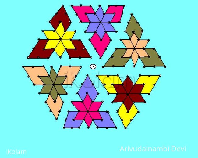
15 dots kolam
About 15 dots kolam : PRINT
the following is a 15 dots design. it is very simple. i drew it using ms paint and decoated using adobe potoshop.


the following is a 15 dots design. it is very simple. i drew it using ms paint and decoated using adobe potoshop.


Comments
Lata
Mon, 2010-02-22 08:54
Permalink
This is a beautifully drawn 15x8 dotted kolam. The next time you try such a kolam, please plan some symmetry as far as the colors are concerned. Also, position the kolam in the center of the background, and chop off the excess space around.
Lata
Mon, 2010-02-22 16:17
Permalink
Taking another look here; are the dots placed correctly at the center line (left side)?
Here is another design of the same dot count, that looks like this one.:
http://www.ikolam.com/node/3720
Lata
Mon, 2010-02-22 17:16
Permalink
Does anyone have this particular design in their collections/notebooks? I remember seeing this design made with 14x7 (interlaced). Does anyone have some variations?
Padma Prakash
Tue, 2010-02-23 00:20
Permalink
Hi lata, I have this in my rangoli books. Dots are same but instead of straight lines, i have drawn like flowers and leaves around. and in the same dots i have a different design if possible i will upload shortly.
jkmrao
Mon, 2010-02-22 17:30
Permalink
Just a quick note. This pattern is actually interesting. There is a skewing of the perfect pattern. This shearing can be done either to the left or to the right (in this one the bottom is moved to the left and top to the right). Colourwise, there is a particular thing that is interesting in this. The reversal of colours for the patterns related by 180 deg rotation is noteworthy. If a graph paper with dots had been used, the rangOli would have turned out more perfectly. ( By the way, the skewing of patterns like this was done by me in one of my moodles http://www.ikolam.com/node/7407?p=1930 )
Regards! - mOhana
Lata
Mon, 2010-02-22 17:46
Permalink
Thanks for the explanation Mohanaji. I guess the skewing explains the interesting twist in the overall look. I think this pattern with the 14-7 dot grid gives the straight forward look for the kolam. It would be interesting to see the 15 dotted skewed version right next to the straightforward 14 dotted version, to see the difference. Maybe I can work on it.
dibbutn
Mon, 2010-02-22 22:27
Permalink
Lovely bright colors and cute kolam
Padma Prakash
Tue, 2010-02-23 01:03
Permalink
Hi Priya, the rangoli is good and nicely done with MS Paint. Next time maintain symmetry ok. All the best.
lakshmiraghu
Tue, 2010-02-23 01:41
Permalink
nice one.
judelined
Tue, 2010-02-23 02:45
Permalink
If you are using adobe for decorating then I think you can use for drawing too - it will come out much better - try and see next time Priya. This is a good attempt
sudhabalakrishnan
Tue, 2010-02-23 03:57
Permalink
good design with bright and bold colours.
cpdeepa
Wed, 2010-02-24 01:00
Permalink
Beautiful. your colouring pattren is different.Nice.